
Role: UX Researcher/ UX Designer/ Interaction Designer/ UI Designer
Project Type: 1-week Design Sprint
Client / Partner: Vodafone Ireland
Team: Rebecca Jones
Contribution
- UX design
- UI design
- Usability analysis
- Human-centered design


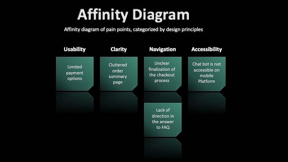


Wireframes progression
Payment page


Med-fidelity wireframe of increased payment options
Original Payment Screen
High-fidelity wireframe of increased payment options
Order summary page
Design rationale
- Providing multiple payment options increases user agency by allowing customers to choose their preferred payment method, improving overall usability.
- Quick payment methods minimise interaction cost and reduce checkout friction, helping users complete purchases more efficiently.
- Recognisable payment logos leverage users' existing mental models, enabling faster visual scanning and making the selection process more intuitive.
Checkout page


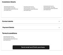


Original Finalization of checkout
Med-fidelity wireframe
of improved CTA button
High-fidelity wireframe
of improved CTA button

High-fidelity wireframe of proposed progress bar
Design rationale
The CTA was changed from "Send by Email" to "Confirm/finish" to better communicate that an additional step is required before purchase completion. Improving visibility of system status reduces ambiguity and helps users confidently progress through the checkout flow.
Design rationale
A progress indicator improves visibility of system status by showing users where they are in the checkout journey, reducing uncertainty and increasing confidence throughout the process.
Chatbot page


Original Mobile Version
Med-fidelity wireframe
of accessible chatbot


High-fidelity wireframe
of accessible chatbot
Design rationale
- Integrating a chatbot provides users with immediate support and guidance, helping them locate information more efficiently and improving overall navigation.
- The chatbot streamlines common tasks by reducing the time and effort required to find answers or complete actions.
- As an additional support channel, it enhances accessibility by offering users an alternative way to interact with the website.
- Implementing the chatbot as a slide-out panel allows users to maintain their place within the website while accessing assistance. This supports user control and freedom, enabling seamless movement between browsing and support without disrupting the overall journey.
Order summary page


Original Order Summary
Med-fidelity wireframe
of improved summary page
High-fidelity wireframe
of improved summary page

Design rationale
- Removing repetitive content declutters the summary page, allowing users to focus on the key details of their purchase and reducing cognitive load.
- Presenting a clear, concise overview of the selected package increases confidence by ensuring users fully understand what they are purchasing before checkout.
- Prominent edit actions provide users with autonomy and control, enabling them to quickly review and modify their selections if needed.
- Incorporating Vodafone branding throughout the summary page reinforces trust, strengthens brand consistency, and assures users they remain within the Vodafone ecosystem.
- Using package specific icons creates stronger visual associations with the selected product, improving consistency, recognition and overall clarity.
FAQ page


High-fidelity wireframe
of improved navigation and direction in FAQ answer
Original FAQ Page
Med-fidelity wireframe
of improved navigation and direction in FAQ answer
Design rationale
- The original FAQ provided a blunt response for new customers without offering a clear next step, creating a potential dead end in the user journey.
- Adding a "Get Connected" CTA provides users with clear direction and support, helping them progress towards a relevant action rather than leaving the page without guidance.
- When selected, the CTA highlights the deal section above, creating a clear visual pathway and reducing the effort required to determine the next step.
- This interaction supports progressive guidance by helping users navigate the website with confidence, ensuring they remain engaged and can seamlessly continue their journey toward purchase.